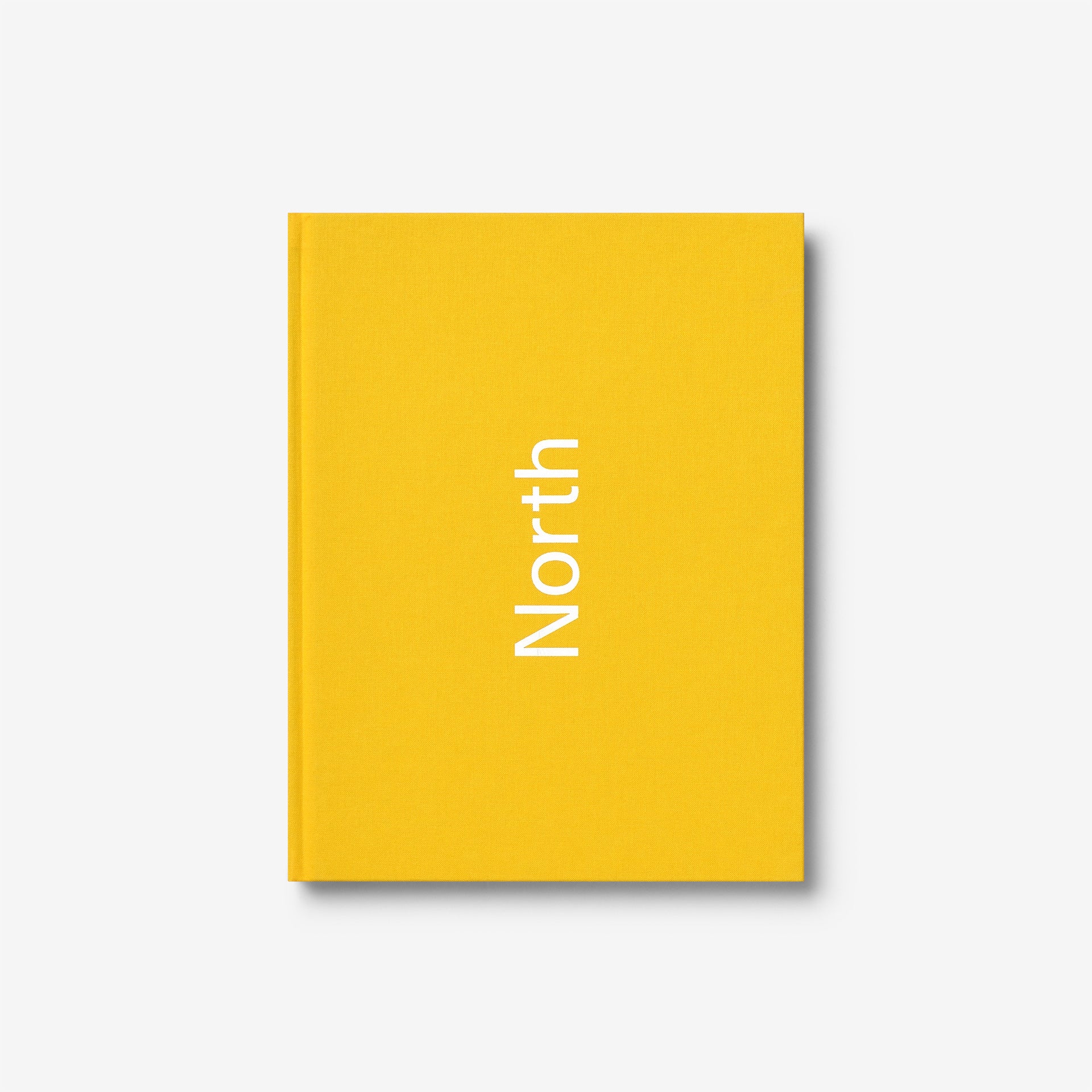
North: Extracts from visual identities
The long-awaited monograph of the UK’s leading graphic design and branding agency.
The world is full of design companies, but none of them are like North. Formed in 1995 by Sean Perkins, the studio has always followed a highly individualistic path. This individualism manifests itself in many ways: most notably in the absence of a densely populated studio website; there are no hyperactive social media feeds; even the studio’s name, derived from Perkins’ origins in the unmetropolitan north of England, stands for frill-free, plain speaking, visual directness. It’s almost as if North is a well-kept secret. Yet the group has a devoted worldwide following, and attracts myriad clients keen to hire them for their ability to produce memorable and carefully engineered visual identities.
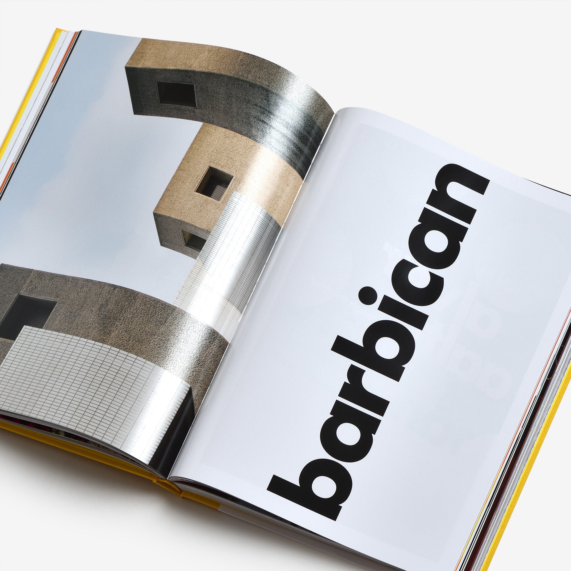
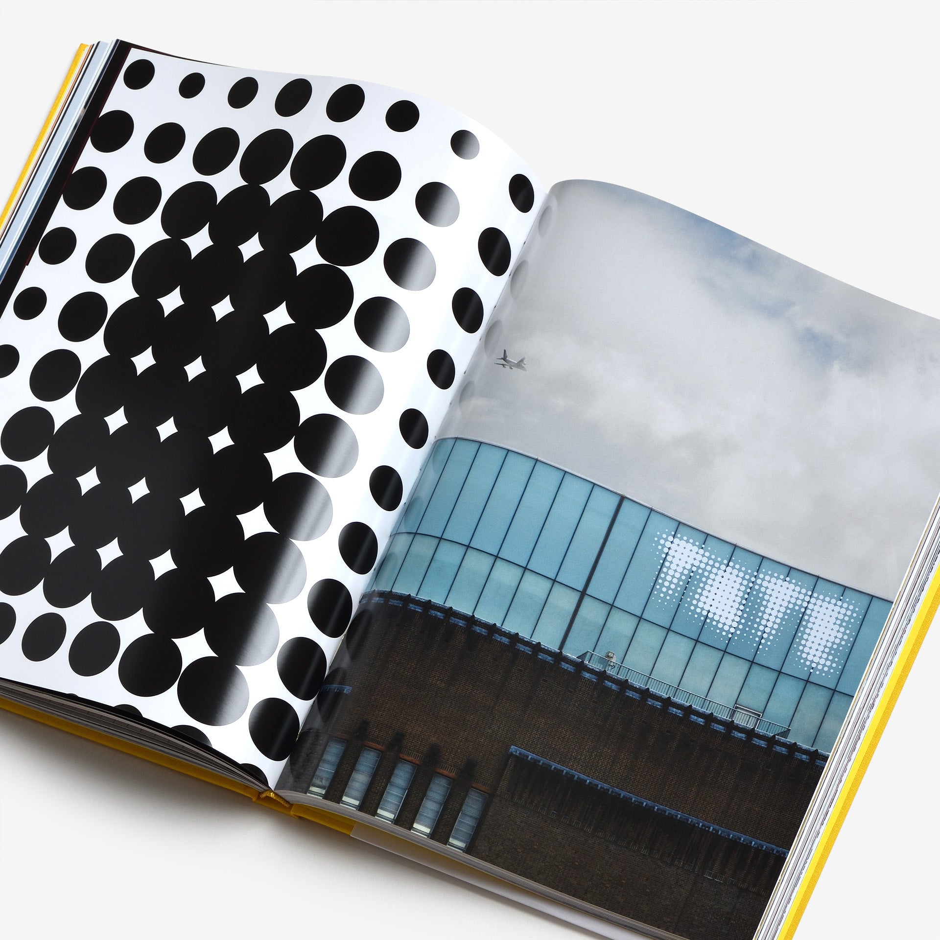
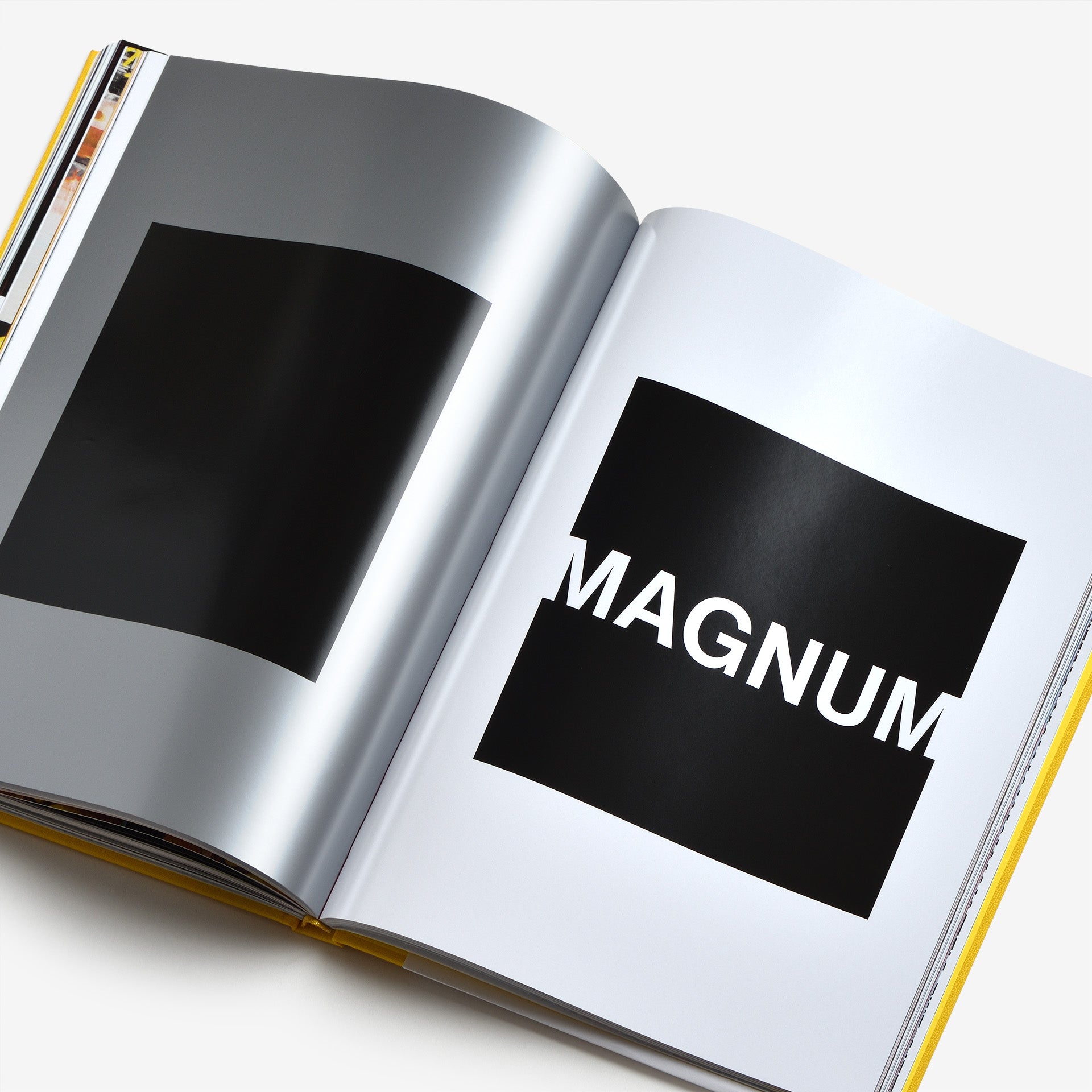
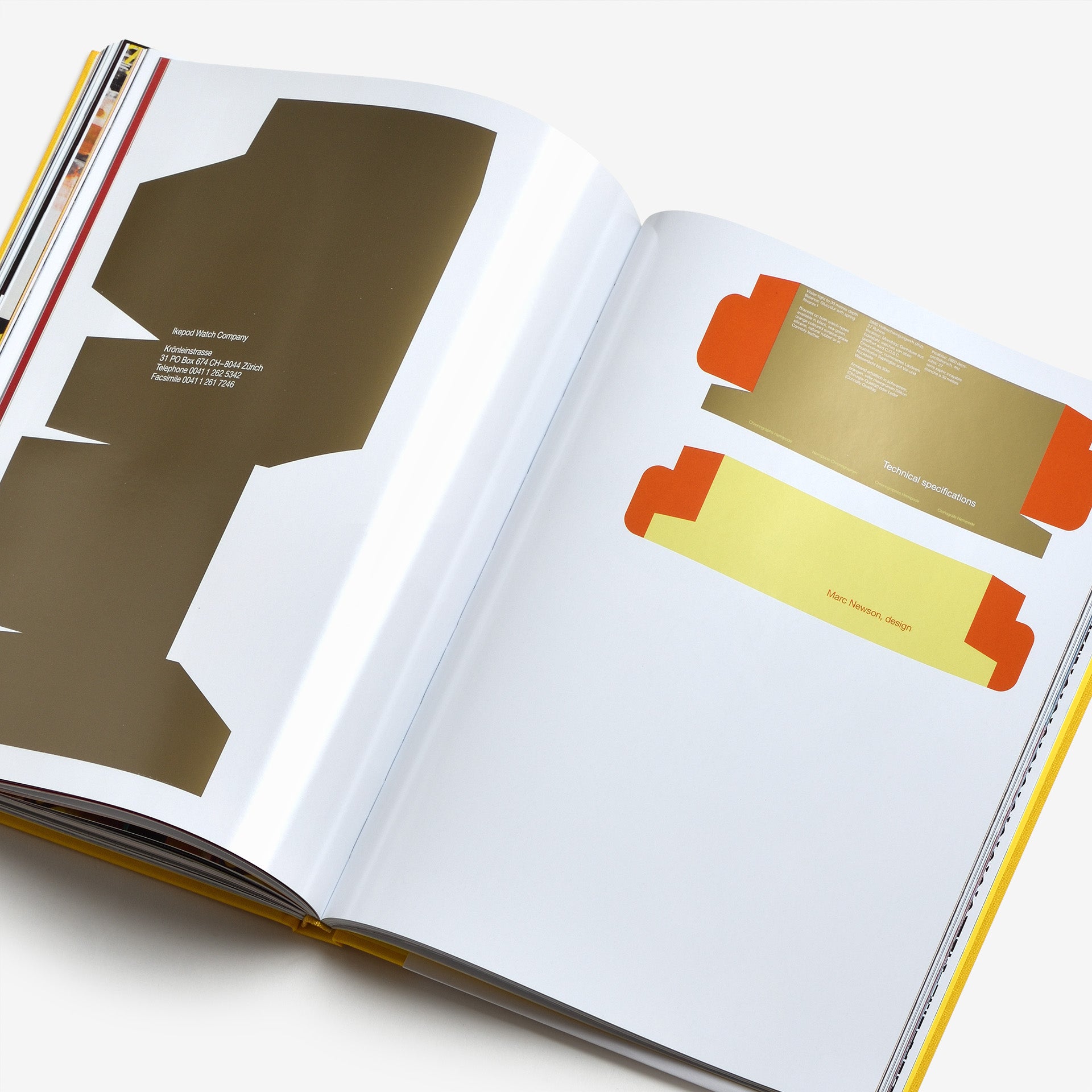
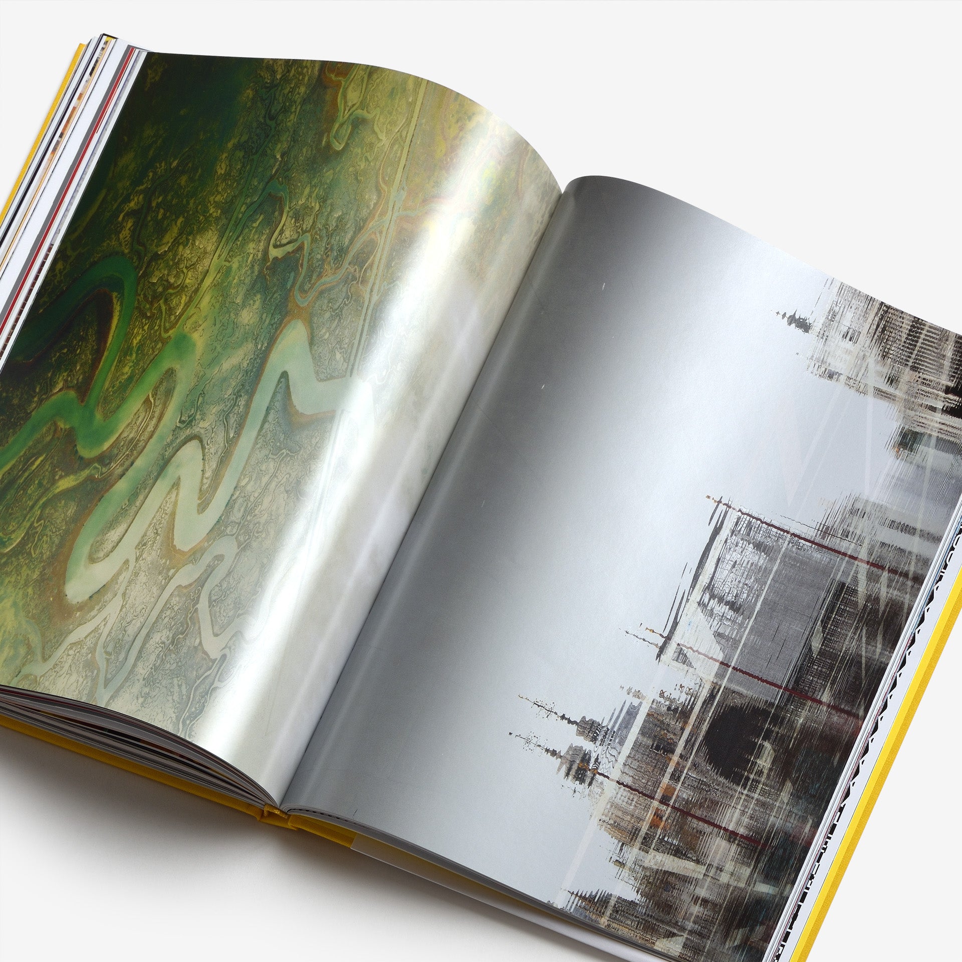
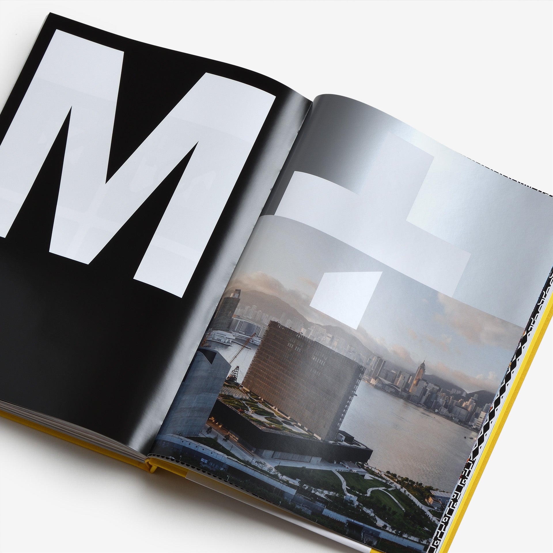
North’s work is the product of sharp-brained research, high-end craft and precise visual expression. And as can be seen in the pages of this book, the studio’s first monograph, the result is a rich crop of brand identities, packaging, exhibitions, books, posters and logos. It includes work for Tate, Southbank, Munch (Oslo), Co-op, Barbican, Samsung, Meta, Science Museum, The Royal Mint and M+ (Hong Kong). On the grounds that graphic design is required to ‘speak for itself’, the book dispenses with descriptive or biographical texts. Instead, the reader is engaged by more than 300 pages of articulate and eloquent visual expression, arranged in a rigorously planned mix of photography, typography, layout and colour.
Like North itself, the book is unlike other design books. That’s what makes it a North book.
Pages: 304
Dimensions: 230 × 300 mm
Format: Hardcover
Language: English
Year: 2024
Publisher: Thames & Hudson
